About...
Grab This Blog's Widget! < Amarettogirl
visual artist and writer marisol diaz

i am a self-defined Nuyorican creative (that is a Puerto Rican who is from both the isles of Manhattan, NYC and the Caribbean). I share daily in the joy of education and live in a cute port town in New York, in a 'teensy-weensy' apartment with my two dogs and canary named Valentino. Check out my Etsy shop for purchasable pieces. Please do not reproduce imagery off of this site without explicit credit and no derivatives may be made of my original imagery- Thank You.

Creative Commons License
This work by marisol diaz is licensed under a Creative Commons Attribution-NoDerivs 3.0 Unported License.
Add to Technorati Favorites
pingg Invites & eCards
bloglovin
Sunday2.1.jpg
MondayArtdayButton.jpg
amarettogirl. Get yours at bighugelabs.com/flickr
3ww1.jpg
pingg Invites & eCards
Grab This Blog's Widget! < Amarettogirl
CRAFT: I'm a Crafter!
The Small Is Beautiful Manifesto

Entries in Inspiring Artists (55)

Monday
Feb232009

Objectified Rags to Riches or My 'Slumdog Millionaire' Art Piece Pick!

Since one aspect of my 'living an artful life' blog is to promote the eco-conscious in art making, I like to highlight artists/designers that use materials and resources in fresh, evocative ways. Sometimes that means recycling old objects to make something new, and sometimes it means using the material that is so plentifully available all around us to make something sustainable and usable - so this post I give you Stuart Haygarth whose chandeliers are my slumdog millionaire art piece pic of the day!

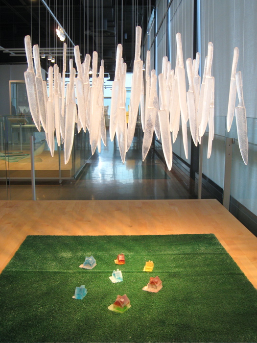
Stuart Haygarth's Optical Chandelier

In the movie Slumdog Millionaire, an over-wrought, inundated, economically-severed place (the slums of Mumbai India) give birth to two children who end up orphaned but not destitute- since they are filled with illuminating hope for a future destiny to love each other. Their brilliance of life becomes manifested through a "Who Wants to be a Millionaire televsion show" and a brutal accusation of cheating. Now this may seem as a stretch, but my artist eyes see that same story line when I see Stuart Haygarth's chandeliers...objects plentiful, disregarded, over-wrought, inundated give off such a spectacular shape, form and light.

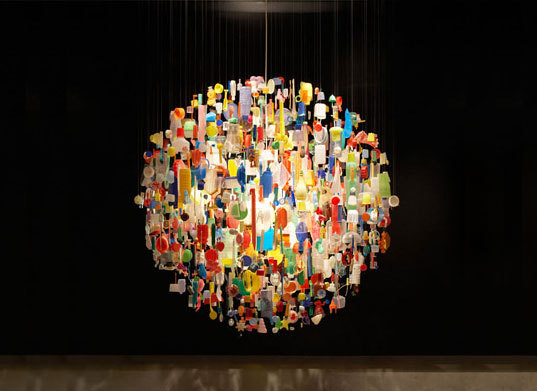
Stuart Haygarth's Tide Chandelier

So seeing as Slum Dog Millionaire was the big winner at the Oscars last night - I only thought it fitting to find an artist who I think is the 'slumdog-millionaire-designer' of the day! Some of the objects that make up these chandeliers are objects that you would find a plenty in landfills, dollar stores or in your pantry.Mr. Haygarth collects, cleans and categorizes these objects (sometimes for years) before composing them into forms.

My work is about giving banal and overlooked objects a new significance. The finished piece of work takes various forms such as chandeliers, installations, functional and sculptural objects. - excerpt from Stuart Haygarth's online posted profile.

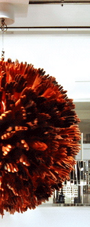
Detail of Stuart Haygarth's Selffridge Harpoon 321

So who is Stuart Haygarth? Well, I discovered this artist/designer/lighting designer through design sites and blogs such as the Design Museum and Moco Loco. Mr. Haygarth is an England born artist who for many projects and commissions uses objects that are debris found along the coastline of Dungeness Beach in Kent, UK, such as this Selffridge named Harpoon321 made of found rubber fisherman gloves that have changed in tints and tones as they have been used and worn. To see more and to learn more about Stuart Haygarth another good link is Icon Magazine Online<


As for Slum Dog Millionaire if you haven't seen it- you must! It will defy any preconceived notions you have, illuminate the forgotten joy you had in love and thrill you the way a great movie should. And, if you're a comment leaving type - let me know about the unexpected and unlikely places you find beauty!

Tuesday
Jan272009

Adobe Illustrator and Kawaii Madness!

As I have grown to love ALL things Japanese, I wanted to share in the Kawaii (and the Kawaii not) madness!

Definition of Kawaii: Since the 1970s, cuteness|可愛さ|kawaisa has become a prominent aspect of Japanese popular culture, entertainment, clothing, food, toys ... en.wikipedia.org/wiki/Kawaii

Kawaii Not: Cute Gone Bad by Meghan Murphy Buy It! You'll Like it!

Last Spring I was perusing through a bookstore (like I usually do) and I found the strangest little book, it was so cute (or according to the title, not) entitled - Kawaii Not Cute Gone Bad. It's a desktop flip-book with vector graphics by Meghan Murphy. I then found out the book is a compilation of a web-comic by Ms. Murphy and you just have to check out the Kawaii Not: the webcomic for cute gone bad site -its a delight! Ms. Murphy's designs are witty, punchy, fun and often very humorous. Through the preparing to write this post I found Ms. Murphy's online illustration portfolio entitled- Murhypop which is also a real treat - she is a fresh, sophisticated, freelance illustrator with some great clients already under her belt! To see her amazing vector illustrations go to www.murphypop.com.

A peek inside the Kawaii Not bk by Meghan Murphy

So as my readers know I have been re-teaching myself Adobe Illustrator since back when I knew the program (in the days when Macs were rectangular cubes and I bought an upgrade behemoth with a wacom tablet) which was a while ago. Since then I've fallen out of the computer art loop and the program Adobe illustrator turned fancy and it morphed into the 'creative suite', needless to say I forgot much.


Well thankfully Ms. Murphy's book came along and it offered me great inspiration to getting back into it. I highly recommend this four panel comic strip book to anyone in need of some daily humor and interested in vector illustrations. And so in honor of her, here is one of my 'cute gone bad' illos done to practice with Adobe tools - in true Meghan Murphy style it's a bit cheeky so, I hope no one is offended:

my Adobe Illustrator 'cute gone bad' illo inspired by meghan murphy
Sunday
Jan112009

Inspiring Artist - P Brigitte Coovert

Ecila Glamor - Zombuki Pullip Photo Print For Sale on Etsy

In hunting down one of my new christmas presents (a new Pullip doll from Valley of the Dolls), my hub and I made a discovery - a new artist and what will be for many- a new medium- introducing ZOMBUKI's!


Artist Brigitte Coovert customizes Pullip, Dae and Blythe dolls to become what she playfully calls Zombuki's:
Zombuki, a combination of the words “zombie” and “kabuki,” was a term dreamed up with the help of a friend some time ago. Zombukis are meant to be a hybrid of many styles and cultures (the zombie itself being both alive and dead), able to embody many looks, to be chimeras of the doll world.

- P Brigitte Coovert

As soon as I discovered there was a book entitled Zombuki's Love You - I bought it! Especially since the dolls themselves, being original artist pieces and an investment, can be expensive.

Zombukis Love You -Hardcover Book

I was also thrilled to see that Ms. Coovert has a phenomenal Zombuki gallery page with stunning photography that MUST BE Seen by all so please click on GALLERY! If You Purchase a Zombuki through the Valley of the Doll site - Generally, a Zombuki will come with coordinated clothing and a plush/felt companion. She also has a beautiful Flickr Page in which she features Desktop Wallpaper Images FOR PERSONAL USE only - which I think is quite generous!!

Desktop Wallpaper (FlCKR)For Personal Use Only from and by P Brigitte Coovert

If You Want to Purchase an actual Zombuki doll go to: Valley of the Dolls
To see ALL the phenomenal pieces of art by Ms. Coovert go to: The Zombuki site
To read more about Ms. Coovert see her ABOUT page on her Blog: Unwed Human Female
To buy her other - uber-cute products go to: Ms. Coovert's Etsy shop- Zombuki's Love You

Sunday
Dec212008

Letters from Father Christmas

A Christmas Gift for the Young Souls in Our Lives


One of my Favorite Things- notice that my heading states 'young souls' not necessarily young people. My husband and I were in our early thirties when we discovered (or rediscovered) this incredible lesser known work by J.R.R. Tolkein (Yes, The Lord of the Rings author) entitled Letters From Father Christmas. In fact, it was December 23rd, 2003 at approx. 2:50pm when we came across a copy of the book in Borders (I found the receipt nestled in between the pages).

Letters From Father Christmas by J.R.R. Tolkein So for today's post (three days away from Christmas) I thought it would be great to share this extraordinary work with you. Tolkein wrote a letter under the guise of Father Christmas every year for his children. It would arrive in the mail with postage implying it had traveled from the North Pole. And if you're thinking well isn't that quaint, think again - these letters were incredible, masterfully created, down to the handwriting and fantastical events/ illustrations and the not-so mundane details of a daily life in the North Pole. If the Polar bear had to write in lieu of Father Christmas the handwriting was practically illegible and he spoke of how difficult it was to hold a writing instrument in a paw, and if it was shaky well you know how cold it is in the North Pole. However, the North Pole was no romanticized heaven here on earth for Tolkein, there were goblins and wars there too and daily trials and tribulations to speak of, from roofs caving in and the adventures of Ilbereth the elf (secretary to Father Christmas).

A publication with pull-out letters Griffin & Sabine StyleVarious Postage Art from the Letters

My husband and I have no children and we fell in love with this publication and the magic of it. What an amazing world we live in that we could share in such a brilliant stroke of genius as these letters.

It all happened like this: one very windy day least November my hood blew off and went and stuck on the top of the North Pole. I told him not to, but the North Polar bear climbed up to the thin top to get it down- and he did. The pole broke in the middle and fell on the roof of my house, and the North Polar Bear fell through the hole and made it into the dining room with my hood over his nose, and all the snow fell off the roof into the house and melted and put out all the fires and ran down into the cellars, where I was collecting this year's presents, and the North Polar Bear's leg got broken.

-excerpt from Letters From Father Christmas by J.R.R. Tolkein

Saturday
Nov152008

Kat Macleod - Inspiring Artist

The Cocktail by Jane Rocca, Drawings by Kat Macleod

I came across Australian based illustrator Kat Macleod's work when I went to Philly (Philadelphia, PA) this summer for a day trip. My hub and I took the two hour drive out to Philly to attend a craft fair that was happening in the Philadelphia convention center. However, it wasn't at the craft fair, where I did see so many varied (glass, jewelry, wood, fiber) and wonderful artists/crafters that I saw her work. In fact, it was in the most unlikely of places that I saw my first Kat Macleod piece! I was in Reading terminal (One of my fave Philly spots) taking a break and getting some lunch when I walked by a cookbook shop and I saw this book sitting by the register.

Upon closer inspection I was mesmerized instantly at the this illustrator who was fusing the world of fine art and craft majestically in her delicate watercolor illustrations.

by Kat Macleod

Her fluid fine line is perfectly accented with a vibrant sense of color and design. Part fashion illustration, part fabric and paper collage, Ms. Macleod's work is fresh, inspiring and a lesson to us all to be open minded about materials. You can even ind some hand-stitching in there.

by Kat Macleod

Since this illustrator is from Melbourne, Australia, she is having a solo show in a gallery there called Lamington Drive. The name of her show is entitled The Tiniest Spark and boy do I wish I had a trip to Australia planned for this month, because the exhibit is up until November 29th (what a great Thanksgiving trip that would be!). So if you're luckier than me and headed to Melbourne Australia this month, you know one art stop you most definitely have to make!

Upon some more research I also discovered that Kat Macleod also does the illustration for a site called Michigirl which is an Australian based online style magazine site. It looks as though we can get another book illustrated by Kat Macleod too - Its written by Michigirl and is entitled Like I Give Frock Fashion Forecasts and Meaningless Misguidance.

Tuesday
Nov042008

For The Love of Blogging...

Well, I thought blogging would be just one of those things I could truly stick to in a disciplined fashion. As it turns out, there isn't much beside my four-legged children that I can stick with on a long-term basis- in fact my husband keeps shocking me with the number of years that we've been married (a whopping six and half years!) I'm just one of those people...easily distracted or perpetually overwhelmed by self-imposed deadlines. Hence my blogging has been sparse. In the end I have decided that it doesn't matter how many comments I get, or how frequent I post - but what matters is that I have something to say or an image to share that is of some worth to me.


Today is election day and the US world I live in is somehow going to miraculously change (or not) tomorrow. More young people have been active in ensuring everyone they know takes on their civic duty to vote. Facebook comments read with anxiety, hope and fear. As it has been so easy to get caught up in polarized political attitudes, a good friend and fellow artist Nick Guarracino a.k.a. Grumpyboy reminded me that we shouldn't romanticize or idolize any human, there is no such thing as a perfect or completely good or bad person - at the very least we will wake up tomorrow and finally be done with Bush. Thank you Nick.


Now I offer you my favorite pic of the week, Chica. In this shot she is thoroughly annoyed that I have awoken her from her nap on my desk just for a pic!

Baby Chica Sleeping on My Desk at Work

Now I must return to watching my favorite Rocky scene where Rocky slides down his apartment wall making out with Adrian for the first time! So hot!

Monday
Sep082008

Inspiring Artist - Sylvia Levenson

While I was taking the class at The Studio @ the Corning Museum of glass I got to visit the museum collection frequently. One of my favorite pieces (and there were many) was this piece by artist Sylvia Levenson.

It's Raining Knives by Sylvia Levenson

On of our class assignments was to seek out a piece from the glass collection to respond to via our own art work. As I get adjusted to moving out of NYC and deeper into the jaws of suburbia, and as I watch the continuing politics of fear immobilize people, I was deeply drawn to this sculpture. The title card also spoke volumes about our human exchange with fear.


For me, Sylvia's sculpture invokes the innocence of youth. The colorful houses and even the astro-turf are reminiscent of cloistered safety. The fact that she makes use of glass only adds to tenuous, fragile and volatile potential of the situation.


In my own work I am very drawn to the melancholy of loss, especially innocence lost. I had been feverishly illustrating a series of young girls in my sketchbook and was considering carefully composing them in a paper-doll fashion of sheets of glass. In addition I am very interested in stained glass, and really wanted to consider cutting my sheet glass into forms before I illustrated on them with the vitreous paint (this technique is explained in past post). I was inspired by the element of repetition as well. That is how my art pieces entitled Lost Girls was born.


detail of Lost Girls by marisol diaz


Lost Girls by marisol diaz


So with little time (for class was in its last three days) I cut sheet glass, painted and fired as many girls from my sketchbook and bunnies as I could. The scale is much smaller and less colorful than Levenson's work but the inspiration is there...in my way.


Lost Girls 2 detail by marisol diaz
Monday
Jun022008

Phil Young - Inspiring Artist

P_Young.jpg

This is Phil Young, an inspiring and phenomenal Cherokee and Scotch-Irish artist. I had the pleasure of meeting Phil for the first time this past April when artist Gregg Emery (my husband) and I, did an artist talk at Hartwick College. Phil is my husband's college art professor and much more, they traveled together to the Southwest and Phil made a deep, resonating connection with Gregg. While we were visiting, Phil gave us intimate views of his most recent work and a special in-depth tour of his studio!! We were so fortunate to have this undivided time with Phil. Gregg and I own quite a few of his pieces of art from years back. However, his most recent work continues to be deeply provocative as Phil has been diagnosed with Multiple Sclerosis and comes face to face with this via his artwork. Since I have been known to do 'Inspiring Artists' posts, as I walked through his studio layered with a lifetime of art-making, I thought 'I'm so going to blog about this!!!' So here is a peek into the images, art and words of Phil Young.

py3.JPG

Phil Young MIXEDMEDIABLOODDOUBLEVISIONSCAPEARTIST


"This work is honoring the Creator, the Earth, our non-human neighbors, my family, and the communities from which I come, some of whom are still disconnected. It is also meant as a recognition of years of grappling with cultural outrage, invasive MS, and an affirmation of the powerful, loving beauty of this variegated world and my family stories to reclaim history and identity with hope, humor and healthy being."


Phil%20Young%202.JPG

"Each night I give myself a Copaxone shot, one of the medicines with some success at lowering the severity and rate of “progression” of Multiple Sclerosis. It is like meeting a friendly scorpion which acts as a decoy for the MS shark, feeding on the medicine instead of our bodies. This form of autoimmune disease attacks the myelin sheath around our nerves, much like insulation around electrical wires. So, when I’ve had double vision, or more recently, great difficulty walking, the messages from the brain and central nervous system don’t come through correctly."

Philyoung1.JPG

"The drawings often incorporate the back and front diagram of an “idea” body, printed on the instructions from the manufacturer of the medicine. Upon this graphic, muscularly healthy body are grids of injection sites to be rotated: the abdomen, the back of the upper arms, and the right and left hips. There are even warnings such as “inject at least two inches from the navel”. I have enlarged, cropped and printed these shot sites as black and white negative squares on clear acetate. The viewer can expect the unpredictable predictability of MS to generate narratives of continuity and disruption...


...The materials are red sandstone from my home state of Oklahoma, a mixture of charcoal, conte pencils, pastels transferred used to make a form of "carbon paper" (tracing paper), some iridescent acrylic (usually copper), and pencil on a(r)ches cover buff. The numbers were blind stamped into the paper from both sides, somewhat randomly, as were the areas of scratched and pounded points. Sometimes the charcoal and other dry drawing media were blown after they left random marks when the transfer paper was taken off. The tool to make the numbers was one that permanently put serial numbers on car engines and other parts. It will make impressions in steel. The small round puncture holes which also can be seen going in and sometime rising up are a graphic equivalent of giving me(the paper) a daily injection of my Multiple Sclerosis Copaxone medicine."

IMG_7021.JPG

This is a glimpse of the inside of Phil's studio. Phil built this studio himself and he built it on rafters so that the whole space could be picked up and moved where-ever he goes!! I find artist studio shots to be as much self-portraits as facial self portraits.

IMG_7026.JPGIMG_7028.JPG


Here Phil is showing us an art piece that is a play on kitsch jewelry that is often found at trading posts.


IMG_7025.JPG

These photos from two series: “Trading Post Ruins: Delaminations and Cancellations” and the others from “Kinship”, both installations.
The process is; "I found Fiber based paper to be the right one to give me the quality and range of experimentation that I’ve sought since I began these. So, I go into the darkroom armed with the dremmel tool, hammer, Jerry’s mechanic stamping tool, nails, and in the Kinship series, a range of fishing hooks. In the dark, I begin to attack the paper, again from both sides, with the tools. I use the rather small pointed dremmel tool, again related to shots or pock marks, etc. and when used as a drawing line, it sometimes creates a surface like scarification of the skin or incisions. I also use permanent pigment pens, black, silver, copper. Writing is quasi-legible and again includes portions of family stories, some frenetic, Parkinsonian-like marks like my Dad had near the end of his life."


phil3.JPG

"After all the work on the photo paper, it is then exposed. Instead of putting the whole piece into the developer, I spray it like working on a painting. When the spray is more from the side, it catches on the raised scarification lines and reinforces a kind of topography. TP ruins pieces, the acetate is laid down on top of the paper before it is exposed, thus leaving a ghost like image of the words, which has some interesting ironies as related to some of the specific texts."


IMG_7018.JPG
Another kitsch jewelry piece!!

IMG_7019.JPG

"The planks of wood are wooden cedar shingles, each of which are from a rejected bundle which has marvelous holes in them. What you saw are part of a series which I made which includes sections from a poem I wrote, “Wetumka”. What I did was use a dremmel to write in the letters. The marks are very much in line with the marks in the installation papers and that appear in my most “mature” paintings and drawing/collages. After this first stage of the “gouged” inscriptions, I go back and do some subtle painting by staining randomly to reinforce both deterioration and the elevation of family story (again some minor use of iridescent acrylics, hair, dried blood color). How these particular shingles will be displayed is yet to be determined."


1915508-1615717-thumbnail.jpg
Click on Image to See POSTCARDS!
IMG_7029.JPG

If you are interested in purchasing any of Phil Young's paintings (such as the one at the very beginning of this post), I found that Phil is represented by the Sam and Adele Golden Foundation. I hope you enjoyed this as much as I did, let me know!


Sunday
Apr272008

Street Art in Berlin, Tacheles & Andras Bartos

IMG_6830.JPG

Gregg making a rubbing of a manhole in Berlin. You may think why? Well, that rubbing is an excellent image for us to make our OWN silk-screen in order to make our OWN Berlin t-shirts, instead of buying mass produced touristy ones! Once we have our t-shirts made - I'll post them here for you all to see.


IMG_6718.JPGIMG_6722.JPG

Some of the best gummy bears I have ever eaten in my whole life were from Potsdam, Berlin. They actually tasted as though they were made with real fruit juice - not to mention they were mammoth in size.


IMG_6700.JPGIMG_6701.JPG


Berlin's mascot/national-animal is the bear - hence we saw lots of artist renditions of the form. Like these! Since these particular bears were in the lobby of our hotel - they 'embody' paintings of all the popular tourist attractions in the area.


IMG_6872.JPG


IMG_6884.JPG

Now for another kind of street art...see that building- that is the Kunsthaus Tacheles. If you look closely you can see the name of the building written on it.
Tacheles is not so simple to describe, although the tourist's books try to do it justice. It is a counter-culture artist space. A former department store, it now looks like an abandoned building that has been taken over by a self-organized collective of artists. There are studio spaces, a cafe, cinema, performance space, workshops and exhibition space. In the evening it is a night club. The grounds, hallways and ever architectural feature has had an artistic mark placed on it. There are stunning sculptures out back, in addition to surrounding buildings used as canvases. I was so enthralled I took so many pics. SAdly, we saw many petitions out while we there and upon returning have learned that the lease runs out this year - it seems that the future of this space is yet to be determined. For the 'creatives' out there that read my blog, this is sure to be a treat.

IMG_6856.JPG

Here I am out in back of Tacheles in their sculpture garden. I love charging bulls so when I saw this I knew I had to have a pic with it! There were quite a few welded- sculptures out back that were beautiful in their execution. There was also a train, automobile and helicopter covered in graffiti.


IMG_6849.JPG

Here is Gregg out back in front of the helicopter

.

IMG_6859.JPG IMG_6858.JPG IMG_6876.JPG IMG_6867.JPG IMG_6875.JPG
IMG_6855.JPG


This is Gregg in the Tacheles hallway. Now you see what I mean about every iota of the space having a mark on it.


The surrounding buildings are used like mammoth canvases. This soccer mural below is mind-blowing. Click on the thumbnail to see the soccer image up close.


1915508-1524772-thumbnail.jpg


IMG_6852.JPG IMG_6865.JPGIMG_6863.JPG


Gregg and I discovered these small paintings by painter and graphic designer Andras Bartos and we bought one! His paintings are whimsical and also somber takes on humanity. While walking around the neighborhood we also saw his studio.

IMG_6894.JPGIMG_6893.JPG IMG_6889.JPGIMG_6892.JPGIMG_6891.JPG

Well, I have more images but I think is this enough for today. I hope I haven't drowned you all in visual noise!!


Tuesday
Mar112008

Artist Gregg Emery - On Being Centered

gregg.jpg

My husband is both a professional sketcher and a painter. We work in two completely different ways. He is an extrovert and I am in introvert. That is to say he gathers his energy from external sources and I from interenal. With that said, he can draw in public (and does so frequently) I on the other hand have to be alone in the studio - with no one looking over my shoulder!


So about Gregg Emery, he has over two hundred sketchbooks filled with drawings. These are gesture drawings done with a piece of graphite as pictured here:

There is no eraser, no point, only an edge. Therefore, he never erases. Every line even if done in a not-so proportionate way, remains as part of the overall composition. Much like life, we get no erasers- no do-overs. Instead we have to learn to live with the choices we have made, move-on and resolve them -but we can't really erase them. He draws anywhere - and I mean anywhere, at music performances, at broadway musicals, on the subway, in the cafe, restaurants, really just anywhere. I have even seen him draw while he was walking!


IMG_0849.JPGIMG_1180.JPG Most of our students know this side of Emery, but what they don't know is the prolific painter he is and his penchant for abstract yet centered art.
IMG_0830.JPG
IMG_1192.JPG
IMG_0850.JPG

Gregg is concerned with discerning an internal balance within and without our human selves. He is concerend with making connections and the deep value involved with human exchange. His paintings and his drawings remind me of Rumi's poetry on being centered.


To see more of Gregg Emery's work click on his name here! His latest Paris/Munich/Berlin sketches will be posted by Sunday!!!